AP Statistics Curriculum 2007 EDA Freq
From Socr
(Difference between revisions)
(→Definitions) |
|||
| (12 intermediate revisions not shown) | |||
| Line 2: | Line 2: | ||
===Summarizing data with Frequency Tables & Histograms=== | ===Summarizing data with Frequency Tables & Histograms=== | ||
| - | + | There are two ways to describe a data set (sample from a population) - Pictorial Graphs or Tables of Numbers. Both are important for analyzing data. | |
| - | + | ||
| - | === | + | ===Definitions=== |
| - | + | * A '''frequency distribution''' is a display of the number (frequency) of occurrences of each value in a data set. | |
| + | * A '''relative frequency''' distribution is a display of the percentage (ratio or frequency to sample-size) of occurrences of each value in a data set. | ||
| + | * A [http://en.wikipedia.org/wiki/Percentile percentile] is the <u>value</u> of a variable that divides the real line into two segments - the left one containing certain percentage (say 13%) of the observations for the specific process, and the right interval containing the complementary percentage of observations (in this case 87%). The 30<sup>th</sup> percentile is the value (measurement) bound above 30% and below 70% of the observations from a process. | ||
| + | * The (three) '''quartiles''' are the special cases of percentiles for Q<sub>1</sub>=25%, Q<sub>2</sub>=50% (median) and Q<sub>3</sub>=75%. | ||
| - | + | ===Example=== | |
| + | The table below shows the stage of disease at diagnosis of breast cancer in a random sample of 2092 US women. | ||
| - | = | + | <center> |
| - | + | {| class="wikitable" | |
| - | + | |- | |
| - | + | ! Stage | |
| + | ! Frequency | ||
| + | ! Relative Frequency | ||
| + | |- | ||
| + | | 0 | ||
| + | | 197 | ||
| + | | 0.09 | ||
| + | |- | ||
| + | | I | ||
| + | | 691 | ||
| + | | 0.33 | ||
| + | |- | ||
| + | | II | ||
| + | | 703 | ||
| + | | 0.34 | ||
| + | |- | ||
| + | | III | ||
| + | | 314 | ||
| + | | 0.15 | ||
| + | |- | ||
| + | | IV | ||
| + | | 187 | ||
| + | | 0.09 | ||
| + | |- | ||
| + | | Total | ||
| + | | 2092 | ||
| + | | 1.00 | ||
| + | |} | ||
| + | </center> | ||
===Computational Resources: Internet-based SOCR Tools=== | ===Computational Resources: Internet-based SOCR Tools=== | ||
| - | * | + | * [http://socr.ucla.edu/htmls/SOCR_Charts.html SOCR Charts] allows you to generate graphical representations (including frequency histograms) of a variety of datasets. |
| + | * The [[SOCR_EduMaterials_ChartsActivities | SOCR Charts activities]] provide usage-instructions, examples and demonstrations of how to use SOCR Charts. | ||
| - | |||
| - | |||
| - | |||
| - | |||
| - | |||
===Hands-on activities=== | ===Hands-on activities=== | ||
| - | + | You can copy and paste the first 2 columns in the data table above in the [http://socr.ucla.edu/htmls/SOCR_Charts.html SOCR Charts] (BarChart --> XYPlot --> HistogramDemo7). You can see [[SOCR_EduMaterials_Activities_Histogram_Graphs | this SOCR Charts activity]] for help with histogram plots. | |
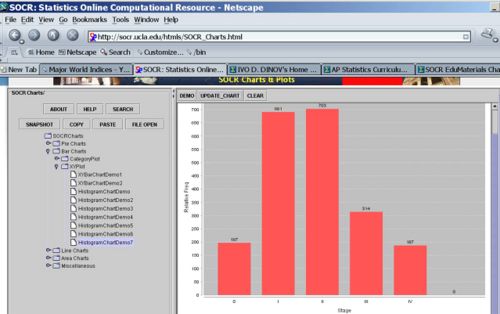
| + | * The graph below illustrates the (raw) frequency histogram (using counts) | ||
| + | <center>[[Image:SOCR_EBook_Dinov_EDA_012708_Fig1.jpg|500px]]</center> | ||
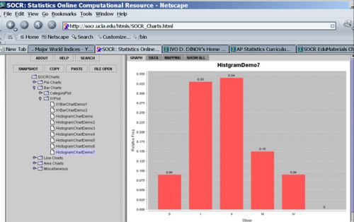
| - | * | + | * The graph below shows the relative frequency histogram (using the last column of the table above). |
| + | |||
| + | <center>[[Image:SOCR_EBook_Dinov_EDA_012708_Fig2.jpg|500px]]</center> | ||
| + | |||
| + | ===[[EBook_Problems_EDA_Freq | Problems]]=== | ||
<hr> | <hr> | ||
| + | |||
===References=== | ===References=== | ||
| - | * | + | * [http://www.stat.ucla.edu/%7Edinov/courses_students.dir/07/Fall/STAT13.1.dir/STAT13_notes.dir/lecture02.pdf Lecture notes on EDA] |
<hr> | <hr> | ||
Current revision as of 18:44, 28 June 2010
Contents |
General Advance-Placement (AP) Statistics Curriculum - Summarizing data with Frequency Tables
Summarizing data with Frequency Tables & Histograms
There are two ways to describe a data set (sample from a population) - Pictorial Graphs or Tables of Numbers. Both are important for analyzing data.
Definitions
- A frequency distribution is a display of the number (frequency) of occurrences of each value in a data set.
- A relative frequency distribution is a display of the percentage (ratio or frequency to sample-size) of occurrences of each value in a data set.
- A percentile is the value of a variable that divides the real line into two segments - the left one containing certain percentage (say 13%) of the observations for the specific process, and the right interval containing the complementary percentage of observations (in this case 87%). The 30th percentile is the value (measurement) bound above 30% and below 70% of the observations from a process.
- The (three) quartiles are the special cases of percentiles for Q1=25%, Q2=50% (median) and Q3=75%.
Example
The table below shows the stage of disease at diagnosis of breast cancer in a random sample of 2092 US women.
| Stage | Frequency | Relative Frequency |
|---|---|---|
| 0 | 197 | 0.09 |
| I | 691 | 0.33 |
| II | 703 | 0.34 |
| III | 314 | 0.15 |
| IV | 187 | 0.09 |
| Total | 2092 | 1.00 |
Computational Resources: Internet-based SOCR Tools
- SOCR Charts allows you to generate graphical representations (including frequency histograms) of a variety of datasets.
- The SOCR Charts activities provide usage-instructions, examples and demonstrations of how to use SOCR Charts.
Hands-on activities
You can copy and paste the first 2 columns in the data table above in the SOCR Charts (BarChart --> XYPlot --> HistogramDemo7). You can see this SOCR Charts activity for help with histogram plots.
- The graph below illustrates the (raw) frequency histogram (using counts)

- The graph below shows the relative frequency histogram (using the last column of the table above).

Problems
References
- SOCR Home page: http://www.socr.ucla.edu
Translate this page:
