SOCR EduMaterials Activities 2D PointSegmentation EM Mixture
From Socr
Contents |
SOCR Educational Materials - Activities - SOCR Activity Demonstrating Expectation Maximization and Mixture Modeling
Summary
This activity demonstrates mixture modeling and expectation maximization (EM) applied to the problem of 2D point cluster segmentation.
Background
It may be useful to review the mathematics of Expectation Maximization and Mixture Modeling. In this activity, we will demonstrate how the EM and mixture modeling may be used to obtain cluster classification of points in 2D. There are problems where such segmentation is very important for solving a practical problem. 1D and 3D applications of the EM mixture modeling are also included at the end.
Exercises
Exercise 1: SOCR Charts Activity
- This exercise demonstrates the applications of expectation maximization and mixture modeling for cluster classification of points in 2D. Go to SOCR Charts and select Line Charts --> SOCR EM MixtureModelChart. The image below demonstrates the overall look-and-feel of the SOCR EM Mixture Model applet. Try adding several clusters of points and select different number of the kernels/mixtures you want to fit to this data. Notice the adaptive behavior of this iterative algorithm - the kernels will dynamically adjust to fit the data. The image below shows the main widgets/controls of this applet and the results of fitting a mixture of 3 kernels to the defaults data.
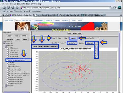
- Data: You can enter data (paired X,Y observations) either via the Data-Tab, using copy-and-paste, or via the add random points button (RandomPts). This applet was designed specifically so that you may enter your own paired observations in tabular form. If you are not interested in data analysis, but want to explore more the properties of the EM mixture model, you may try the second SOCR applet (SOCR Experiments, select Mixture Model EM Experiment from the drop down list of SOCR Experiments on the top-left), which allows you to manually add points by clicking on the graphing canvas. At the end of this document, the step-by-step protocol is included for running the algorithm on any dataset.
- You can also use the 8,000 knee-pain data centroids available here.
- Applet Specifications: You can fit one of two models to your data (Linear or elliptical Gaussian), see the GaussianMix button. Linear model will only show the main direction of variation for a sub-cluster. A Gaussian model will illustrate additional information, including the scope of the kernel coverage. The Normal button allows you to choose Slow, Normal or Fast speed for the iterative EM estimation. The ClearPts will remove all data and reset the applet. The InitKernels button re-initializes the kernels (location and size) and is useful for shaking the EM algorithm to escape the local minimum. A kernel is roughly a weighting function used in non-parametric techniques. Kernel locations are generally non trivial to choose - we use random initial kernel locations (InitKernels button). The drop-down list on the top-right allows you to select the number of kernels you want to fit to this data. There is no exact method for determining this number in all situations (manually or automatically). Typically, one uses the physical or biological properties of the studied data/process to determine the appropriate integer value. On the top, the Step, Run and Stop buttons have the natural functions associated with driving the iterative EM algorithm. The Segment button allows labeling/classification of the points once the EM algorithm has converged or stopped.
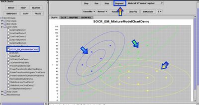
- Segmentation Results: Once the EM algorithm converges to a visually satisfactory result you should stop the iterative process (Stop button) and click on the Segment button. You will obtain a color classification of all points in 2D based on which of the kernels is most likely to contain the point in its neighborhood. In addition to this visual classification, the Data tab-panel will contain a couple of result columns that contain the complete analytical description of the kernels (as 2D Gaussian), the mixture-model weight coefficients, the log-likelihood function (quantifying the match between the mixture model and the data), and color-coded membership of all data points to one of the kernels.
Exercise 2: 1D and 3D Examples of SOCR EM Mixture Modeling
You may also see the action of the same SOCR EM Mixture modeling algorithm for analyzing 1D or 3D data.
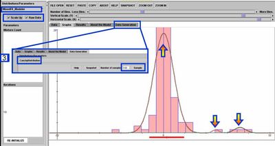
- For 1D data, you can see the EM mixture model fitting used by the SOCR Modeler to fit a polynomial, spectral or distribution model for randomly sampled or observed data. To see this, go to SOCR Modeler and select MixedFit_Modeler from the drop-down list of models on the top-left. The figure below shows the result of fitting a 3-kernel Mixture of Normal (Gaussian) distributions to the histogram of a random sample of 100 Cauchy random variables.
- A demonstration of a 3D data analysis using the SOCR EM Mixture model is included in the LONI Viz Manual. This shows how 3D brain imaging data may be segmented into three tissue types (White Matter, Gray Matter and Cerebra-spinal Fluid). This is achieved by LONI Viz (Dinov et al., 2006) sending the segmentation tasks to SOCR and SOCR returning back the 3D segmented volumes, which are superimposed dynamically on top of the initial anatomical brain imaging data in real time. The figure below illustrates this functionality. Other external computational tools could also invoke SOCR statistical computing resources directly by using the SOCR JAR binaries and the SOCR Documentation.

Questions
- How stable is the EM algorithm in finding a solution? Does this solution appear to be unique?
- What affects the convergence properties of the EM algorithm (data characteristics, number and properties of the starting initial kernel(s), etc.)?
Step-by-Step Data Analysis Protocol
The following 10 steps show the protocol for entering and analyzing new data using the SOCR EM Mixture model Chart tool.
- Go to: http://www.socr.ucla.edu/htmls/SOCR_Charts.html --> Line Charts --> SOCR EM Mixture Chart.
- ClearPnts (remove default data).
- Data-Tab: Click the top-left cell & paste in your data (in two column tabular format) using the paste button.
- Mapping Tab: Map the two columns (C1 and C2) accordingly to X & Y axes.
- Click UpdateChart button.
- Select Number of Kernels (drop-down list of integers on the top-right).
- InitKernels (choose an appropriate starting configuration – could be arbitrary)
- Use the Step or Run buttons to go one iteration or continuously in the EM Mixture algorithm.
- Use Stop button to stop (for continuous running).
- Click the Segment button to find point association to kernels.
- Finally, you can right-click on the SOCR Graph to adjust the display or save/print the result.
Your quantitative results will be stored as new columns in the data table (Data Tab).
Manual Kernel Initialization
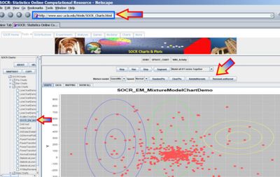
Note that you can manually initialize the Gaussian kernels as follows: To add (up to 9) kernels manually, hold down the ALT key, click and drag the mouse to select a rectangle for each of the kernels. While holding the ALT key, you can repeat this to add more manually chosen kernels (up to 9). There will be 2 new buttons that appear in this manual kernel-selection mode. The removeLastKernel button will remove the last manually added kernel, and the autoInitKernel button will switch back to the auto kernel-selection mode, where kernels are randomly chosen. The figure below illustrates the manual kernel selection process
Data Import Format
Remember that in the 2D mixture modeling applet you only need 2D data (2 columns). If you have more remove the unnecessary columns first (e.g., using Excel), or load all columns but later specify which 2 columns shoud be considered as X and Y. When File-importing data, note that your data must be in CSV format. If you have a header Column, it must start with a hashtag (#), like this:
#X	Y
11	73
20	88
19	73
15	65
21	57
26	101
24	117
35	106
37	96
The easiest way is to copy-paste only the values (no headers) into the applet by clicking on the first cell (1,1) and clicking the paste button (do not paste in data using short keys), and then follow the step-by-step protocol to generate the plot. Remember after you paste in (or File-load in) the data, you need to go to the Mapping Tab to select your 2 columns (X,Y), click “Update Chart”, etc., according to the step-by-step protocol.
Try this protocol with the SOCR Knee Pain dataset.
See also
- SOCR Mixture-Distribution applet
- SOCR 1D Mixture Modeling Activity
- SOCR Hierarchical Clustering Analysis Activity
- Knee Pain Simulated Data
- See also the Bivariate Normal Distribution activity and webapp.
References
- Ivo D. Dinov, Expectation Maximization and Mixture Modeling Tutorial (December 9, 2008). Statistics Online Computational Resource. Paper EM_MM, http://repositories.cdlib.org/socr/EM_MM.
- Genetic Algorithms and Mixture Modeling
- Lecture notes on Statistical Methods in Neuroimaging
- Web-based executable Applet: http://socr.ucla.edu/htmls/SOCR_Modeler.html
- SOCR EM Wiki activities
- HTML JavaDocs
- Source code
- EBook Section on MOM and MLE estimation
- SOCR Home page: http://www.socr.ucla.edu
Translate this page:
