SOCR EduMaterials Activities Histogram Graphs
From Socr
(Difference between revisions)
(→'''Questions''') |
|||
| (9 intermediate revisions not shown) | |||
| Line 1: | Line 1: | ||
| - | == [[ | + | == [[SOCR_EduMaterials | SOCR Educational Materials ]] - SOCR Histogram Generation Graphing Activity == |
== Summary == | == Summary == | ||
| - | This is an exploratory data analysis SOCR activity that illustrates the generation and interpretation of the histogram of quantitative data. The [http://en.wikipedia.org/wiki/Histogram complete details about histograms can be found here]. In a nutshell, a histogram of a dataset is a graphical visualization of tabulated frequencies or counts of data within | + | This is an exploratory data analysis SOCR activity that illustrates the generation and interpretation of the histogram of quantitative data. The [http://en.wikipedia.org/wiki/Histogram complete details about histograms can be found here]. In a nutshell, a histogram of a dataset is a graphical visualization of tabulated frequencies or counts of data within equal spaced partition of the [http://en.wikipedia.org/wiki/Range_(statistics) range of the data]. A histogram shows what proportion of measurements that fall into each of the categories defined by the partition of the [http://en.wikipedia.org/wiki/Range_(statistics) data range] space. |
==Exercises== | ==Exercises== | ||
| Line 9: | Line 9: | ||
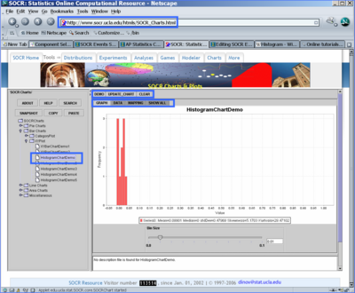
* First, point your browser to [http://www.socr.ucla.edu/htmls/SOCR_Charts.html SOCR Charts] and select the '''HistogramChartDemo''' (under BarCharts --> XYChart). There are three different ways to select data for this histogram chart: | * First, point your browser to [http://www.socr.ucla.edu/htmls/SOCR_Charts.html SOCR Charts] and select the '''HistogramChartDemo''' (under BarCharts --> XYChart). There are three different ways to select data for this histogram chart: | ||
** Use the default data provided for this chart ('''DEMO''' button); | ** Use the default data provided for this chart ('''DEMO''' button); | ||
| - | ** Enter your own data. This can be done by copying to the mouse buffer data from external spreadsheet/table, clicking on the top-left cell in the SOCR Histogram Data table and pasting ('''Paste''' button) the data into the histogram data table. Remember to '''MAP''' the data - this indicates what columns rows, parts of the data need to be used in | + | ** Enter your own data. This can be done by copying to the mouse buffer data from external spreadsheet/table, clicking on the top-left cell in the SOCR Histogram Data table, and pasting ('''Paste''' button) the data into the histogram data table. Remember to '''MAP''' the data - this indicates what columns rows, parts of the data need to be used in the histogram calculations. Then you click '''UPDATE''' chart to have the new graph drawn in the '''Graph''' tab-pane; |
| - | ** Obtain SOCR simulated data from the '''Data-Generation''' tab of the [http://www.socr.ucla.edu/htmls/SOCR_Modeler.html SOCR Modeler] ( | + | ** Obtain SOCR simulated data from the '''Data-Generation''' tab of the [http://www.socr.ucla.edu/htmls/SOCR_Modeler.html SOCR Modeler] (an example is shown in exercise 3, as well as in the [[SOCR_EduMaterials_Activities_PowerTransformFamily_Graphs |SOCR Power Transform Activity]]). |
<center>[[Image:SOCR_Activities_HistogramGraphing_Dinov_061307_Fig1.png|400px]]</center> | <center>[[Image:SOCR_Activities_HistogramGraphing_Dinov_061307_Fig1.png|400px]]</center> | ||
| - | |||
=== '''Exercise 2''': Histogram from Categories and Frequencies=== | === '''Exercise 2''': Histogram from Categories and Frequencies=== | ||
| Line 18: | Line 17: | ||
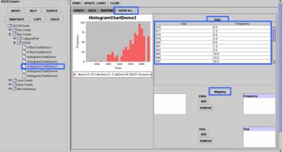
* Notice that this time, the chart requires the user to enter the counts/frequencies of observations within each of the range categories (in this default data case, ''year''). | * Notice that this time, the chart requires the user to enter the counts/frequencies of observations within each of the range categories (in this default data case, ''year''). | ||
* Try revising some of the numbers in the second (frequency) column and click '''UPDATE''' button to see the effect of these changes on the histogram. | * Try revising some of the numbers in the second (frequency) column and click '''UPDATE''' button to see the effect of these changes on the histogram. | ||
| - | * | + | * Remember that if you enter your own data you need to go to the '''MAP''' tab-pane and select the columns that contain your histogram bin and frequency columns. |
| + | * Using the '''SHOW_ALL''' tab-pane you can see all three (graph, data and mapping) in the same view. | ||
<center>[[Image:SOCR_Activities_HistogramGraphing_Dinov_061307_Fig2.png|400px]]</center> | <center>[[Image:SOCR_Activities_HistogramGraphing_Dinov_061307_Fig2.png|400px]]</center> | ||
| - | === '''Exercise 3''': Histogram from | + | === '''Exercise 3''': Histogram from Simulated Data=== |
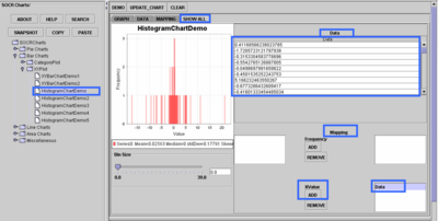
| - | * Let’s first get some data: Go to [http://www.socr.ucla.edu/htmls/SOCR_Modeler.html SOCR Modeler] and generate 100 Cauchy Distributed variables. Copy these data in your mouse buffer (CNT-C). Of course, you may use your own data throughout. | + | * Let’s first get some data: Go to [http://www.socr.ucla.edu/htmls/SOCR_Modeler.html SOCR Modeler] and generate 100 [http://www.socr.ucla.edu/htmls/SOCR_Distributions.html Cauchy Distributed] variables. Copy these data in your mouse buffer (CNT-C). Of course, you may use your own data throughout this exercise. |
| + | * Next, paste (CNT-V) these 100 observations in [http://www.socr.ucla.edu/htmls/SOCR_Charts.html SOCR Charts] '''HistogramChartDemo''' (BarCharts -> XYChart). Go to the '''MAP''' tab-pane and select the first column (where you pasted your data) in the '''XValue''' bin. Click '''Update Chart''' to see the histogram plot of these 100 Cauchy observations in RED! | ||
| + | * Note that the shape of this data histogram resembles the shape of the [http://www.socr.ucla.edu/htmls/SOCR_Distributions.html Cauchy distribution] that we sampled this data from. | ||
<center>[[Image:SOCR_Activities_HistogramGraphing_Dinov_061307_Fig3.png|400px]]</center> | <center>[[Image:SOCR_Activities_HistogramGraphing_Dinov_061307_Fig3.png|400px]]</center> | ||
| - | + | =='''Questions'''== | |
| - | + | * What is the effect of the width/size of the histogram bin on the shape of the resulting histogram? If we alter the bin-size, would the shape of the histogram change significantly? Does the sample-size play role in this? | |
| - | + | * Would you expect the shape of the sample histogram to ''look like'' the shape of the population distribution the data sample came from? | |
| - | + | ||
| - | + | ||
| - | + | ||
| - | + | ||
| - | + | ||
| - | + | ||
| - | + | ||
| - | + | ||
| - | + | ||
| - | + | ||
| - | + | ||
| - | + | ||
| - | + | ||
<hr> | <hr> | ||
Current revision as of 17:04, 1 May 2008
Contents |
SOCR Educational Materials - SOCR Histogram Generation Graphing Activity
Summary
This is an exploratory data analysis SOCR activity that illustrates the generation and interpretation of the histogram of quantitative data. The complete details about histograms can be found here. In a nutshell, a histogram of a dataset is a graphical visualization of tabulated frequencies or counts of data within equal spaced partition of the range of the data. A histogram shows what proportion of measurements that fall into each of the categories defined by the partition of the data range space.
Exercises
Exercise 1: Simple Histogram from Raw Data
- This exercise demonstrates the construction of a histogram plot from raw quantitative data.
- First, point your browser to SOCR Charts and select the HistogramChartDemo (under BarCharts --> XYChart). There are three different ways to select data for this histogram chart:
- Use the default data provided for this chart (DEMO button);
- Enter your own data. This can be done by copying to the mouse buffer data from external spreadsheet/table, clicking on the top-left cell in the SOCR Histogram Data table, and pasting (Paste button) the data into the histogram data table. Remember to MAP the data - this indicates what columns rows, parts of the data need to be used in the histogram calculations. Then you click UPDATE chart to have the new graph drawn in the Graph tab-pane;
- Obtain SOCR simulated data from the Data-Generation tab of the SOCR Modeler (an example is shown in exercise 3, as well as in the SOCR Power Transform Activity).

Exercise 2: Histogram from Categories and Frequencies
- Again, point your browser to SOCR Charts. This time select the HistogramChartDemo3 chart (under BarCharts --> XYChart). Use the default data provided for this chart (DEMO button).
- Notice that this time, the chart requires the user to enter the counts/frequencies of observations within each of the range categories (in this default data case, year).
- Try revising some of the numbers in the second (frequency) column and click UPDATE button to see the effect of these changes on the histogram.
- Remember that if you enter your own data you need to go to the MAP tab-pane and select the columns that contain your histogram bin and frequency columns.
- Using the SHOW_ALL tab-pane you can see all three (graph, data and mapping) in the same view.

Exercise 3: Histogram from Simulated Data
- Let’s first get some data: Go to SOCR Modeler and generate 100 Cauchy Distributed variables. Copy these data in your mouse buffer (CNT-C). Of course, you may use your own data throughout this exercise.
- Next, paste (CNT-V) these 100 observations in SOCR Charts HistogramChartDemo (BarCharts -> XYChart). Go to the MAP tab-pane and select the first column (where you pasted your data) in the XValue bin. Click Update Chart to see the histogram plot of these 100 Cauchy observations in RED!
- Note that the shape of this data histogram resembles the shape of the Cauchy distribution that we sampled this data from.

Questions
- What is the effect of the width/size of the histogram bin on the shape of the resulting histogram? If we alter the bin-size, would the shape of the histogram change significantly? Does the sample-size play role in this?
- Would you expect the shape of the sample histogram to look like the shape of the population distribution the data sample came from?
- SOCR Home page: http://www.socr.ucla.edu
Translate this page:
