SOCR EduMaterials Activities PieChart
From Socr
Revision as of 20:34, 5 September 2007
Contents |
PIE CHARTS
Background
When comparing groups of data, Bar Charts are one of the best approaches for single category data analysis. Interpreting bar charts are not difficult as observers clearly look for the tallest bar, shortest bar, growth or shrinking of bars over time, comparison of bars, and change in bars representing the same category in different classes since bar charts are a type of visual data presentation.
Although Bar Charts are simple, it is easily abused as users use inconsistent scales, unequal classes, and varying intervals between classes. Still, Bar Charts offer useful statistical data such as mean, maximum, minimum, range, sample size, and standard deviation.
Description
Go to the SOCR Charts and select Bar Charts from the items located on the left. Then select Category Plot:

By selecting the first nine sets of demo under this category, these images simply demonstrate how bar charts may vary in sizes, classes, shapes, dimensions, and direction as Bar Charts may be presented vertically and horizontally:


The next three demonstrates how Bar Charts may be more eye appealing as they can be presented in 3-dimensions:
The following two demonstrations show that Bar Charts may also have layering classes in which researchers may easily show that one of their main goals is to show how one set of data may be compared for every interval:
The next four demonstrations show how Bar Charts may be stack upon one another also in comparison of data. Layering and stacking bar charts are similar but have some differences in which stacking is clearly for data that cannot be repeated so that all of the bars may be observed. As for layering, some data may be almost equal to another set of data so that when layering the bars, all data may still be seen on the independent variable axis:
The Statistical Bar Chart adopts the characteristics of a typical Bar Chart except that it illustrates mean and standard deviation as well:
Finally, the Waterfall Bar Chart is a unique way to present a Bar Chart that summarizes all data in one bar chart. Each bar chart builds from the previous bar chart to the last set of data, then one bar chart is created at the end to show the total or sum of the data:
Applications
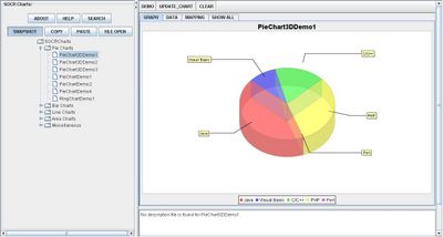
One of the most persuasive elements when proposing data and literature to others is a well-designed chart presentation. For example, students have the ability to display their outcome of a Statistics project by utilizing the Pie Chart as a reference of proportions in the total data set.
For industries, Pie Charts will give them the advantage of organizing their income of different types of products in a more appealing approach that is easy to project their research.
Translate this page:
