SOCR EduMaterials Activities PowerTransformationChart
From Socr
Contents |
POWER TRANSFORMATION CHARTS
Background
Power Transformation Charts ensure that the outcome has a normal distribution. This is helpful for small samples that are obtained from a skewed population as they produce narrow confidence intervals.
For references, visit Wikipedia.
Description
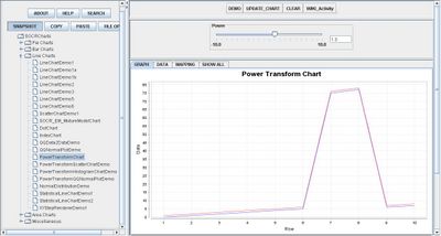
Go to the SOCR Charts and select Line Charts from the items located on the left, then select the demonstration for Power Transform Charts:

The image above is a demonstration of a simple Power Transformation Chart. Note that the image is similar to that of an Index Chart, indicating that prior to the transformation, the data values were skewed.
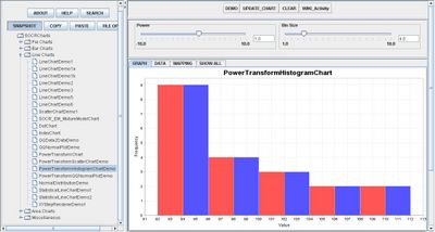
The other demonstrations display charts that are similar to Scatter Plots and Normal Plots. The image below shows a Power Transformation Histogram Chart in which the transformation has changed the values so that they have a normal distribution:

Data Type and Format
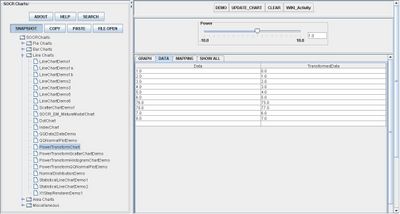
By clicking Data inbetween the Graph and Mapping button, it allows users to input or vary the values of the data set. There is one type of variable allowed in Power Transformation which is the numerical values of the original data and transformed data. Typically, the original data is listed under the first column and the transformed data listed in the next colmun. Notice that above the graphs and charts is a scroll bar in which the user is allowed to adjust the effectiveness of the transformation, allowing users to observe the numerical changes in the data as well:

Applications
One of the most persuasive elements when proposing data and literature to others is a well-designed chart presentation.
For samples that are too small and drawn from skewed populations, utilizing the Power Transformation Chart will allow the outcome to be normally distributed.
Suppose that students have obtained skewed values from a lab. After graphing these values, they noted that the sample is too small and the confidence level is small as well. They then use the Power Transformation Chart to display their values with a normal distribution.
Suppose a national gas company directed a survey but employers realize that the locations of the gas company are skewed as they are mostly saturated in the East Coast. By transforming the data, utilizing the Power Transformation Histogram Chart may be beneficial in their research.
Translate this page:
