SOCR Events May2008 C1 S1
From Socr
SOCR May 2008 Event - Use basic concepts of probability to determine the likelihood of an event and compare the results of various experiments
Write the results of a probability experiment as a fraction, ratio, or decimal, between zero and one, or as a percent between zero and one hundred, inclusive
We can use the SOCR Dice Experiment to illustrate these concepts visually.
Go to the SOCR Experiments, select the Dice Experiment from the drop-down list of experiments in the top-left corner and choose the number of dice (n=1)
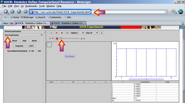
Run the experiment several times by clicking the Step or Run buttons (review the applet information by clicking the Info button)
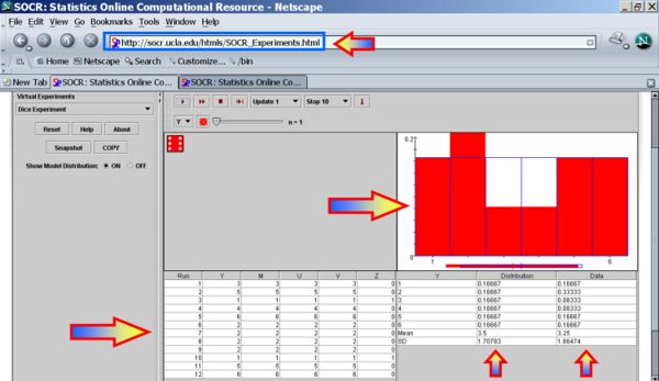
The image bellow shows the result of running 12 trials. Notice the outcomes recorded in the left table (Run=trial index, ..., Z=number-of-ones (aces)), right table (Column1 = possible outcomes of each trial, Column2 = theoretical probability of each outcome, and Column3 = empirical probability for each outcome), and the graphical depiction of Column2 (theoretical probabilities in blue color) and Column3 (empirical probabilities in red color) in the plot above.
Do we expect the values in columns 2 and 3 to be identical? Would they become more similar if we did a larger number of trials?
Try a loaded Die
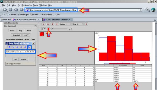
It is difficult to demonstrate a hands-on experiment with a real loaded die. This applet allows you to illustrate this with a virtually loaded die. Click on the die on the top and select desired probabilities (test with up- or down-ramping the probabilities). Notice the changes in the theoretical probabilities and the blue graph. Run the experiment again.
Fraction interpretation
Now let's see how we can graphically interpret fractions. Run this experiment 20 times. Use your mouse to copy (Control-C) the data in the first 6 rows of the bottom-right table.
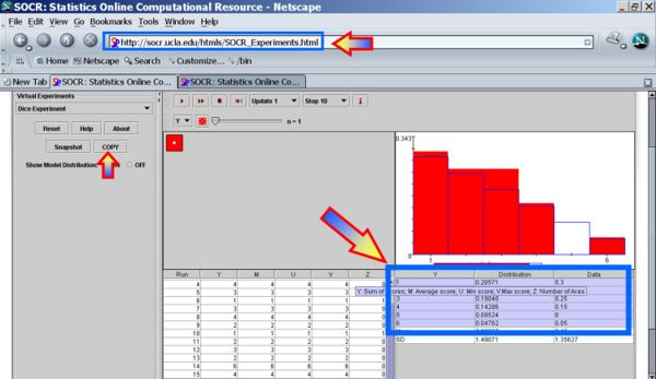
Paste this data (Control-V) in the SOCR Pie Chart. Them Map the first and third columns as shown in the insert image

Finally, click UPDATE_CHART to see the proportions of each of the 6 outcomes in the 20 experiments.
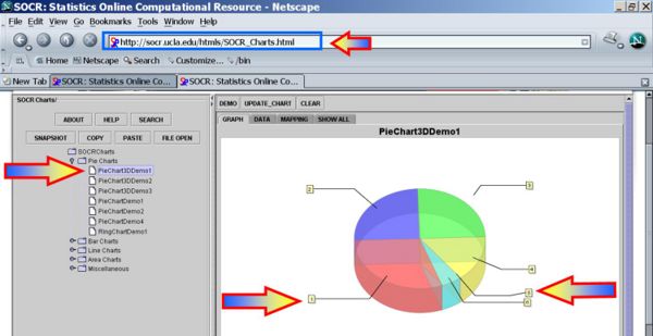
Notice that 1 was the most frequently observed outcome and 5 never showed up, in this specific sequence of 20 experiments of the loaded die. Because the die was loaded the pie slices corresonding to the lower numbers (1 & 2) are expected to be larger than the proportions of the higher numbers (5 & 6).
Compare individual, small group, and large group results of a probability experiment
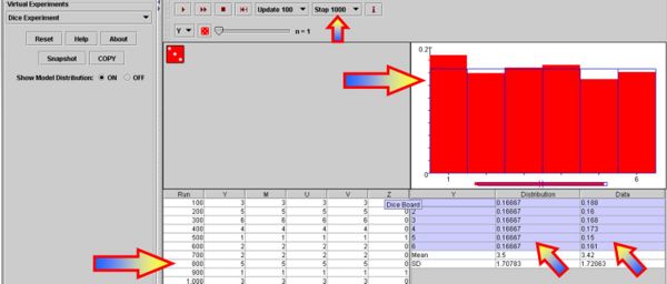
Go back to the fair die by changing the probabilities of all outcomes back to uniform (1/6) change. Then reset the experiment and run it 6 times, then 20, 50 and 100 times. Notice the discrepancy between the theoretical and the empirical probabilities by viewing the (blue=theoretical and red=empirical) graphs and exploring the numerical differences in Column2 (theoretical) and Column3 (empirical) of the bottom-right table. Are these discrepancies or consistencies increasing, decreasing or unpredictably varying with the increase of the number of trial we perform? Can you explain why the theoretical and empirical probabilities become essentially identical for very large number of experiments? The image below shows the result of one random experiment of 1,000 trials.
References
- Utah Secondary Core Curriculum Standards for Statistics
- Interactive Statistics Education EBook
- SOCR Home page: http://www.socr.ucla.edu
Translate this page:
