SOCR EduMaterials Activities AreaCharts
From Socr
Contents |
AREA CHARTS
Background
Area Charts show related data groups. Each group adopts a different value of area in which the sum of all the groups equal to the total area of the data set or 100% of the data. Area charts is similar to a combination of Pie Charts and Bar Charts in which it implies the proportion of each group with two variables of a chart.
Go to [[1]] for more references.
Description
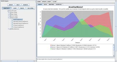
Go to the SOCR Charts and select Area Charts from the items located on the left:

The image above is a demonstration of an Area Chart. Notice that each group has a different color of area so that it they are easily distinguishable and overlapping of the graphs may be observed.
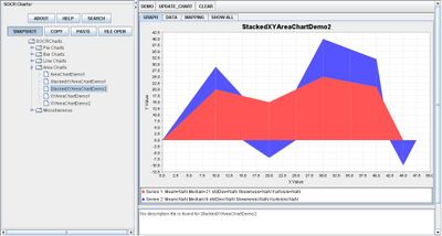
Stacking Area Charts do not allow observers to see groups overlap:

Notice that values may be negative.
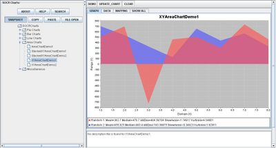
XY Area Charts are used to compare two variables as shown in the image below:

Applications
One of the most persuasive elements when proposing data and literature to others is a well-designed chart presentation.
For example, students have the ability to display their outcome of a Statistics project of comparing frequency and time. By using the Area Chart application, frequency will be the vertical axis and time will be the horizontal axis. The shaded areas under each group may be easily shown and compared by using the Area Chart.
For companies, Area Charts are often useful to compare the growth of business from different years.
Translate this page:
