SOCR EduMaterials Activities QQChart
From Socr
Contents |
Charts Activities - Quantile-Quantile Plot
Summary
This activity describes the need, general methods and SOCR utilities for QQ charts. The simulated data may then be easily copied and pasted in different SOCR Analyses or Graphing tools for further interrogation.
Goals
The purpose of this activity is to:
- show users how SOCR QQ charts are plotted and what conclusions may be drawn
Background
Quantile-Quantile Charts, or QQ Charts, are plots in which observed values are plotted against theoretical quantiles. From the plotted points, a line of good fit is drawn to show the behavior of the data values against the theoretical distribution. For references, visit QQ Charts and Examples.
If F() is a cumulative distribution function, then a quantile (q), also known as a percentile, is defined as a solution to the equation
- F(q) = p, that is, q = F − 1(p),
where p is a given probability. For instance, the median is a 50th percentile, is obtained when p = 0.5. So, to generate a QQ plot, we need to invert the CDF, F. For the Normal and many other distributions, the inverse CDF is known in closed form. SOCR implements and exact and approximate methods for computing the inverse CDF function.
For a given column of data (n = sample size), the following protocol is used to check for normality using SOCR QQ Normal Plot:
- Column 1: Sort the data from smallest to largest (column 1).
- Column 2: Generate the column of Normal quantiles using these n probability values:
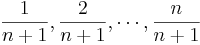 , where n is the number of observations.
- Draw a scatter plot of Column 2 (X axis) vs. Column 1 (Y axis).
If the scatterplot looks linear, then the data distribution is approximately Normal, as the quantiles of the 2 distributions are linearly related.
Description
Go to the SOCR Charts and select Line Charts from the items located on the left, then select the demonstration for QQ Charts:

The image above is a demonstration of a simple QQ Chart. Both demonstrations are similar because they both show specific data values by plotted points and a line of good fit is drawn to show the behavior of the data.
Examples & Exercises
- Exercise 1: What is the main difference between QQ Charts and other types of charts?
Data Type and Format
By clicking Data between the Graph and Mapping button, it allows users to input or vary the values of the data set. There is one type of value allowed in QQ Charts which are numerical or quantitative variables. The image below demonstrates how these values are listed to the corresponding order:

Applications
One of the most persuasive elements when proposing data and literature to others is a well-designed chart presentation.
For QQ Charts, they may be applied to any data values that consist of observed values and theoretical values such as experiments. Suppose scientists developed theoretical values for water consumption among athletic males by age and weight. They then obtain a sample of the population of males and observed the water consumption for each patient. Graphing these values will allow the scientists to draw a line of good fit and help decide the acceptability of their theories.
See also
Power Transform Activity/Applet.
Translate this page:
